Using AI tools to prototype and validate faster
Using research strategy, rapid AI-powered prototyping, and result analysis with Claude Cowork to leverage the document collection process for tax payers.
Roles
Product Designer, and UX Researcher
INDUSTRY
Finances and Accounting
Year
2026
Duration
2 weeks
Overview
The new Organizer was designed to drastically reduce the manual back-and-forth between pros and clients after a job is submitted, turning info gathering into a smarter, pre-filled experience driven by existing documents and initial responses, so pros can start working right away.
Main goals
Maximize pre-fill using the most recent tax return to reduce follow-up questions.
Standardize the info collection flow (questions + documents) to eliminate friction.
Improve case readiness from the start: have clients review pre-filled data and complete any gaps in plain language before submitting.
Key findings
Conversation data between clients and pros validates the question set proposed in the flow.
31% of jobs triggered at least one missing document request — confirming the value of a structured checklist.
Most users going through this flow already have a prior tax return that can seed the base information for a new filing.
Methodology
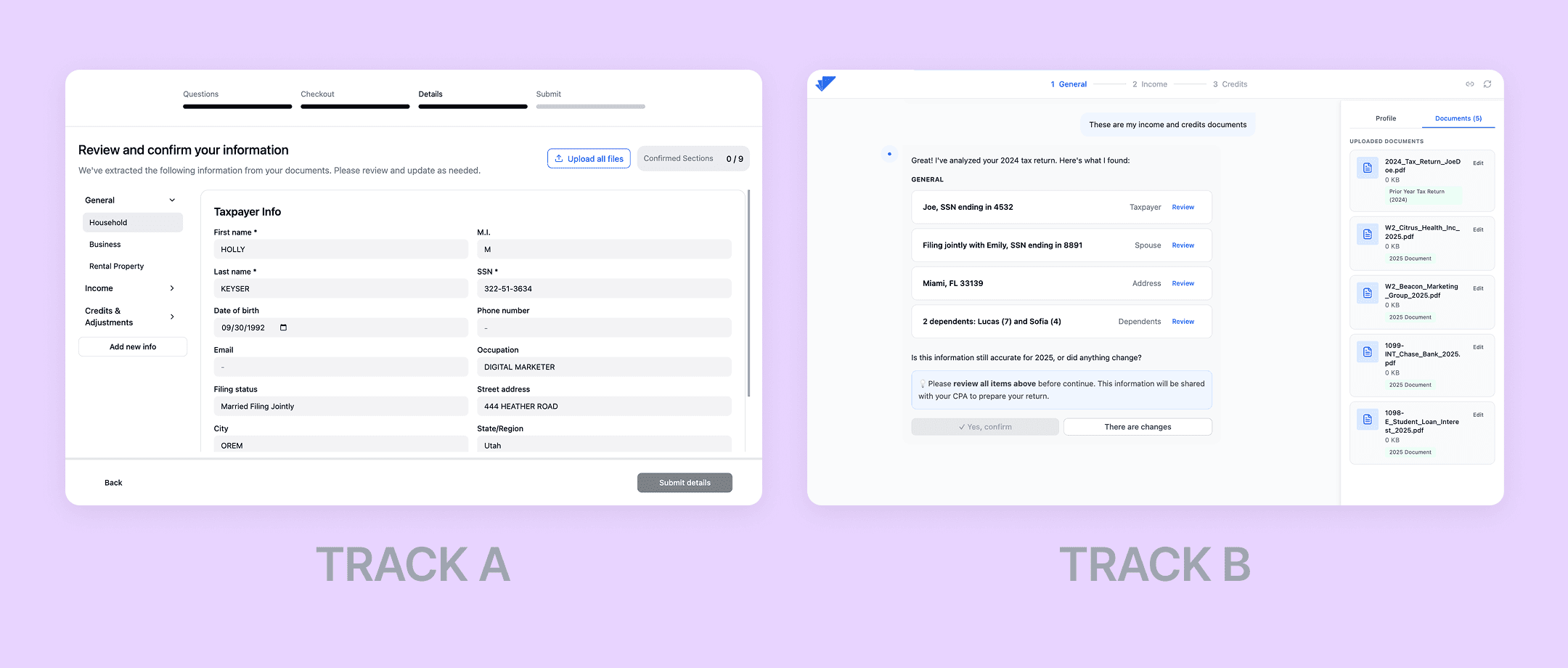
I designed this study to validate whether the Organizer flow reduces friction in info collection and whether users can complete critical tasks with minimal effort, running an unmoderated usability test using an AI-powered tool to build two high-fidelity prototypes. 28 real Taxfyle clients participated, in 12–15 min sessions, completing 4 sequential tasks: service selection & checkout, document upload, adding a dependent, and income entry (W-2).
Track A extends the current Taxfyle experience. Track B proposes a new conversational model, tested against simple filers only.
User testing results
Payment & service preferences: 50% prefer to pay once the return is fully complete; only 7% upfront. Top decision factors: potential additional fees (54%) and estimated completion time (46%). Complex users also prioritized speaking with a specialist before committing (60%).
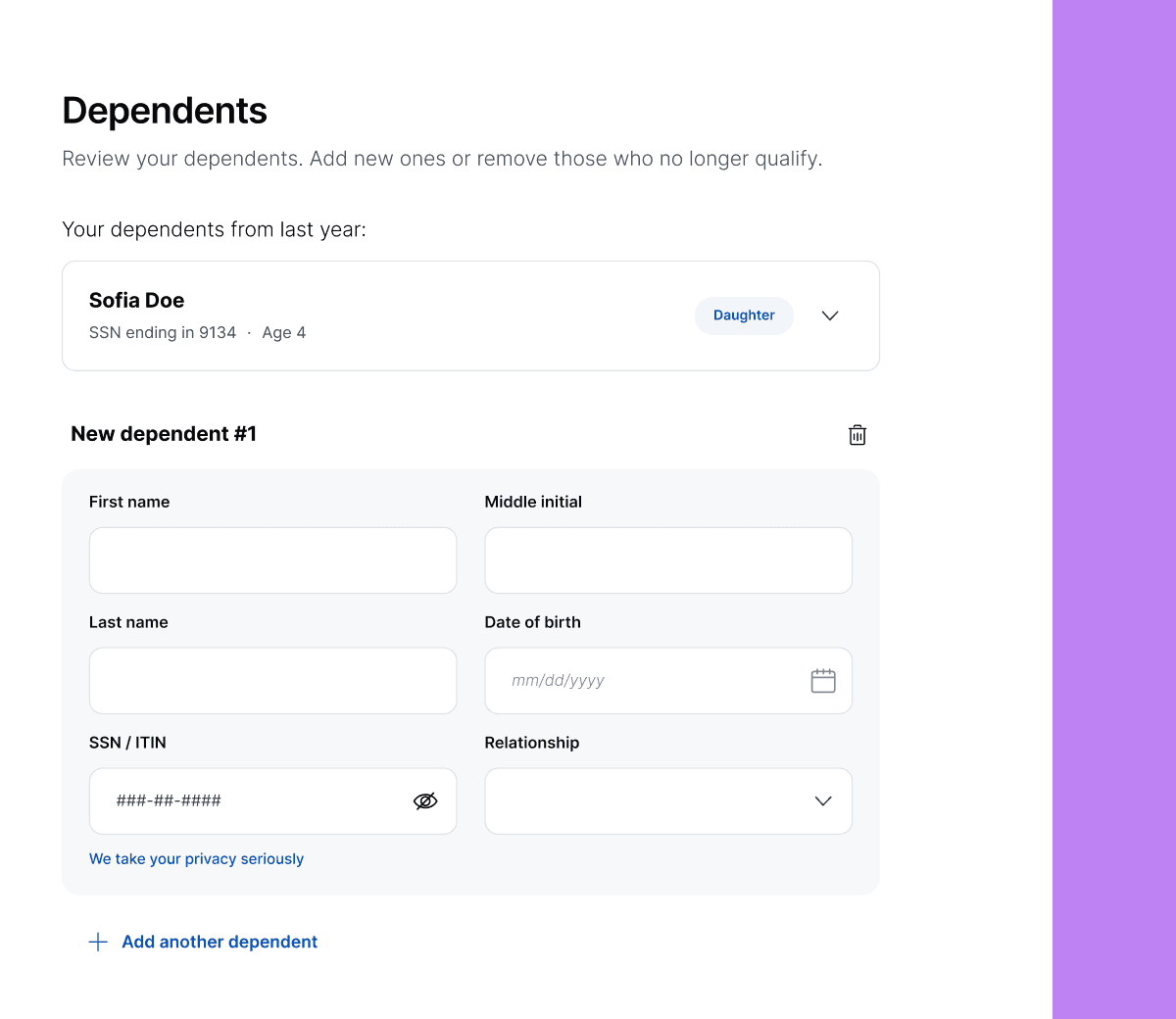
Adding a dependent: The highest-friction task across all segments, with 67–71% misclick rates. The entry point wasn't where users expected — 55% of Track A took an indirect path and rated the experience as neutral.
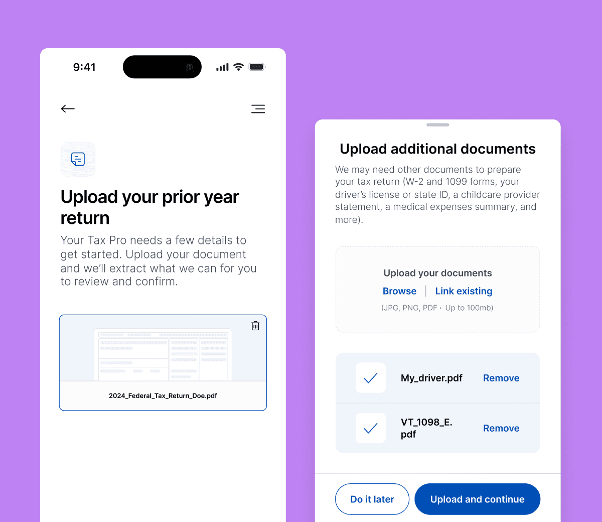
Document behavior: 63% of simple filers needed no guidance to upload; drops to 44% for complex filers, who are 2x more likely to prefer importing from external platforms. Friction here is about user habits, not interface design — consistent with the 31% missing-doc rate in our dataset.
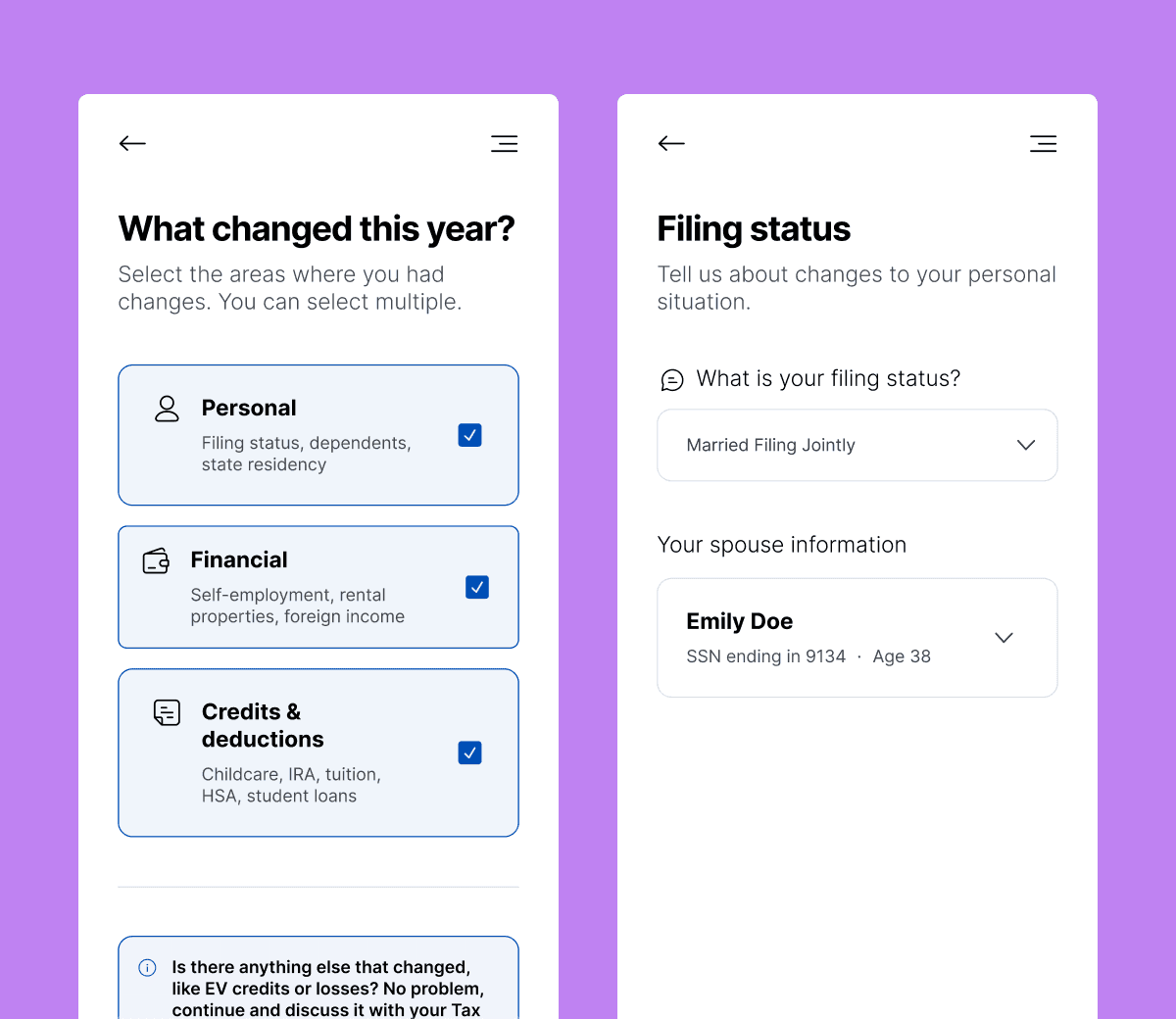
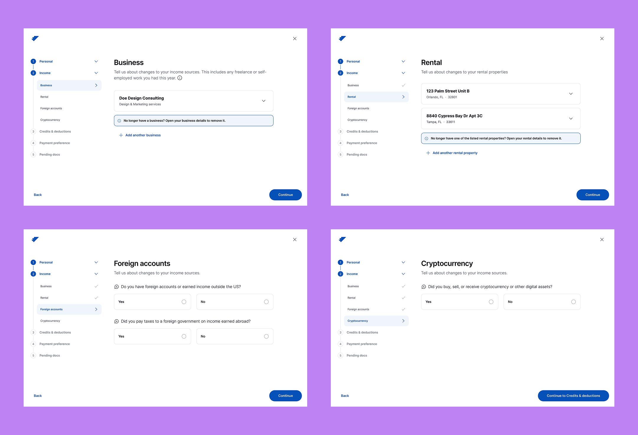
Navigation structure: 61% preferred option A: General | Income | Credits & Deductions. Option D ranked second among users with more complex financial situations.
Balancing data collection by chunks
Despite 100% task completion, Complex A had the lowest NPS (6.0), the highest misclick rate (39%), and the strongest demand for human guidance. The base flow needs to be solid for simple cases and extensible enough to handle complex ones without breaking the experience.
Tools I used
Figma Make
Maze
Claude Code
Figma Design